LaunCHR

BRAND IDENTITY

Concept

LaunCHR is a platform that empowers game studios / developers, to create exceptional crypto-games with the necessary tools and support. Our mission is to facilitate their growth and success, which is the cornerstone of our own achievements. In line with this path, our design philosophy centers on our partners' games as the focal point and star of the show. LaunCHR serves as a powerful instrument, much like a magnifying glass, prism, telescope, or lens, offering a universe or multiverse of crypto gaming possibilities. Our approach is not to boast about our own merits but to work tirelessly like a clock behind the scenes, enabling our partners to shine.

Moodboard

Lamp. It has 1 bulb that radiates just plain white color, that goes through the fibers and makes them shine with their color. Again - the focus is not on the white bulb (in most cases its even hidden inside) the focus is on the beautiful tiny points of light.

Lens. Your ability to focus.

Prism. Allows you to split the incoming light beam into different wavelengths of light (colors).

Telescope. Allows you to discover the universe.

Camera Lens / Camera. Allows you to save the moment for later.

Magnifying glass. You can see things clearer with it.

Night sky. Each star is a unique object, a lot of them have their own solar systems, possibly with unknown life forms.

Grid. Brings order and structure.

Symbolism

Gaming crosshair. Aim. Focus.

Sun. Star. Shining.
Emission.

Crossroad. Ability to choose. Options.

Plus sign. Growth. Adding value.

Multiplication sign. "3x growth".

Compass. Navigation. Direction. Choice.

A tale about the rectangular logo

Once upon a time, there were two companies that had the exact same logo: a white rectangle. One of them was called Eppol and was extremely successful due to their great products and user experience. The other was called ScamPany and while they made some money, they were largely seen as a failure or even a scam. One day, someone decided to conduct a design study by asking customers of these companies for their opinions on the logo.

Eppol logo reviews

"I love how the logo is simple yet effective, it really represents the confidence of the company."

"The rectangle logo gives off a sense of professionalism and stability, which is why I trust this company."

"The simplicity of the logo is what drew me in, it's easy to remember and stands out among other brands."

"The logo may be simple, but it speaks volumes about the company's values and commitment to quality."

"I appreciate the minimalistic approach to the logo design, it really sets the tone for the company's mission."

ScamPany Inc. reviews

"The logo is so bland and unappealing, it made me doubt the credibility of the company from the start."

"Their logo looks like it was made in Microsoft Paint, which is a red flag for any business."

"The lack of effort in the logo design made me skeptical about the company's attention to detail and quality."

"The logo looks like it was ripped off from a stock image website, it doesn't convey any sense of trust or reliability."

"I should have known it was a scam from the logo alone, it looks so generic and poorly designed."

A logo is an identifier, its purpose is to identify. Not sell, explain something, but identify.
It's similar to the photo in a passport, it does not tell much about you, but you can be identified by looking at it.

It's often mistakinly assumed that a logo should evoke some feelings, but it's actually the user experience he gets from interacting with a brand that gives the logo these properties, not the other way around. While a logo's visual appearance can convey a certain aesthetic, such as soft or edgy, complex emotions and associations are a result of the user's interaction with the brand.

Shape Explorations

Based on the concept, moodboard and symbolism above I started to work on the logo.
Trying different ideas, developing custom font, etc.

Unique or Familiar?

"Perfectly balanced. As all things should be" - Thanos

A logo that is both unique and familiar is important because it helps to establish a strong brand identity that stands out from the competition while also being easily recognizable and relatable to customers. A logo that is too unique may be difficult for people to identify or remember, while a logo that is too familiar may not capture the attention of potential customers or differentiate the brand from others in the market. I was aiming for a balance between uniqueness and familiarity.

Reveal

Watch with sound

Colors

In the famous words of Rihanna, "Shine bright like a diamond," but at LaunCHR, we know that diamonds don't shine.
Instead, they Reflect, Refract and Disperse light in various ways.

The final aspect, Dispersion, is particularly intriguing as it reveals the hidden beauty of light.
During this process, a white light beam separates into its component colors, commonly known as VIBGYOR or the rainbow.
This phenomenon exposes something that was previously invisible, creating a new level of understanding and appreciation.
At LaunCHR we adopt a similar approach by promoting, showcasing, and uncovering the potential of projects created by our partners.
Like dispersion, our platform reveals the true beauty and potential of these projects, providing a unique and comprehensive view that was not previously visible.
It is what LaunCHR does. It promotes, shows, reveals projects made by our partners.

Criteria & Guide

Color Output

In the vast world of gaming, there are countless color schemes. Now double that in case we will include projects that are not directly related to gaming in the future. What color works in combination with any imaginable color out there?
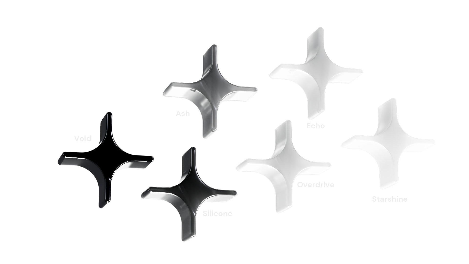
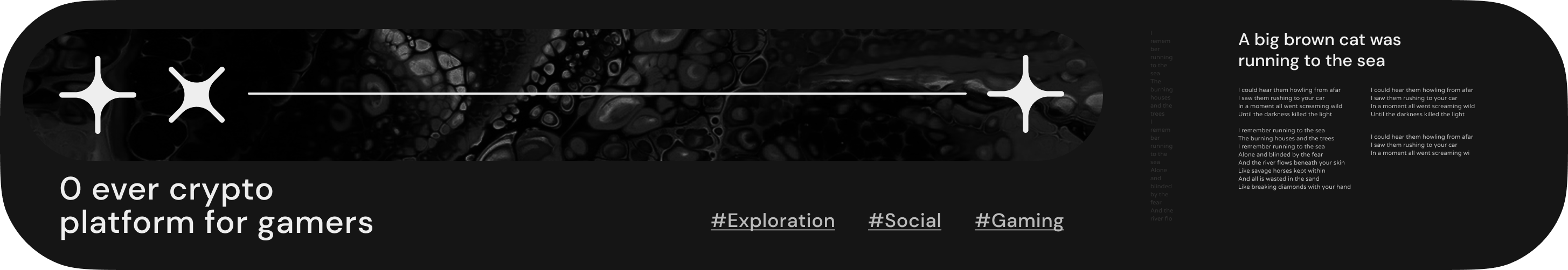
Black.
But it's not about Black as a color but rather the absence of light. In this absence the only visible lights and the focus are the lights of our partners.

The second color is White. And again it's more about the light than the color. We use this light to enhance the colors of our partners (games) in the same way as your screen backlight does right now while you read this text (or the lamp example from moodboard).

We will also use different levels of brightness's, to enrich our composition and make it softer if needed.

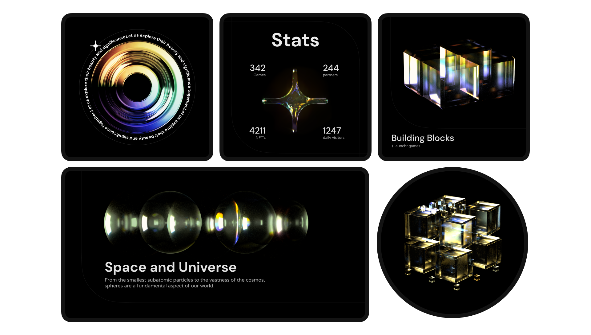
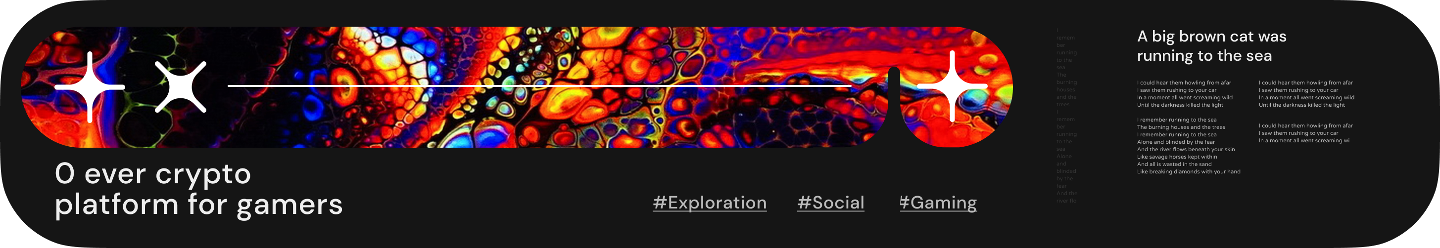
-What if we want to highlight something on the website or create an illustration?
-Then we use any color that fits the theme of the webpage or the illustration. It's not a question of color but rather style, and by style I mean the shapes, 2D/3D objects, textures, 2D/3D materials, icons, the way we stack them, etc.


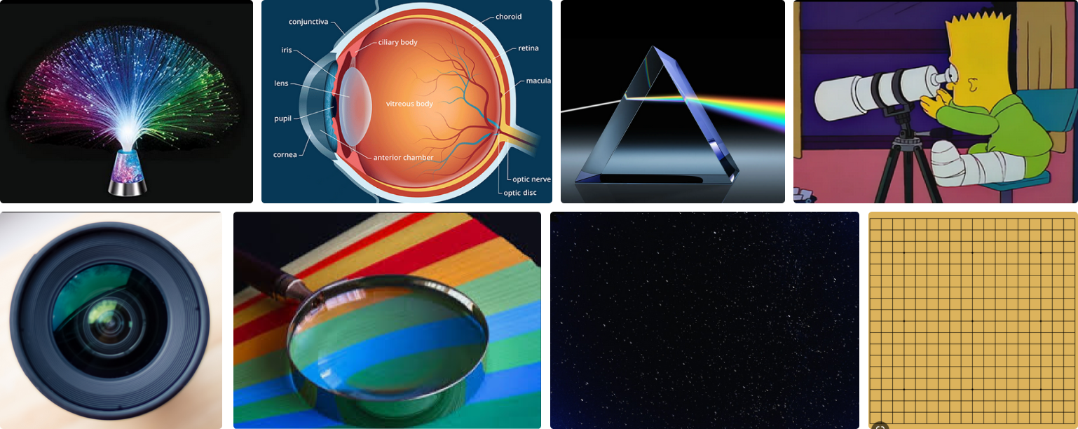
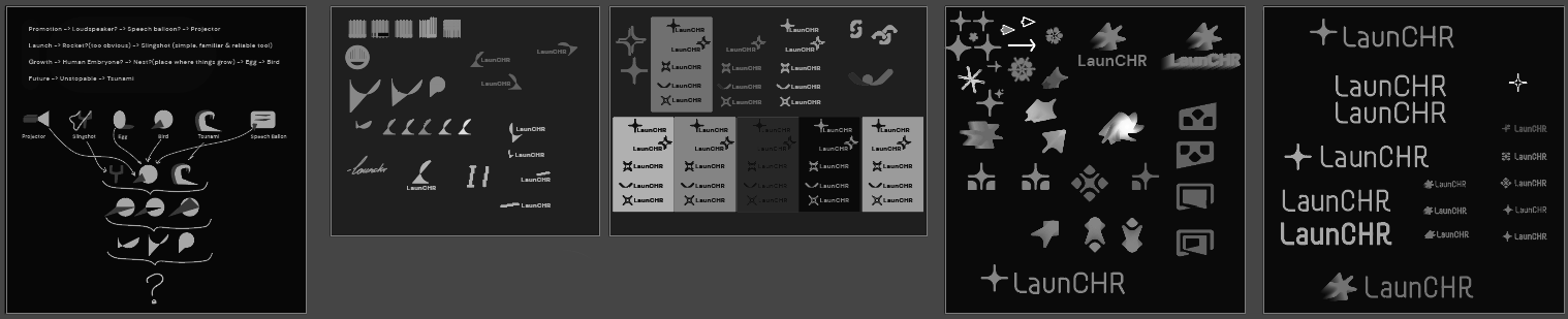
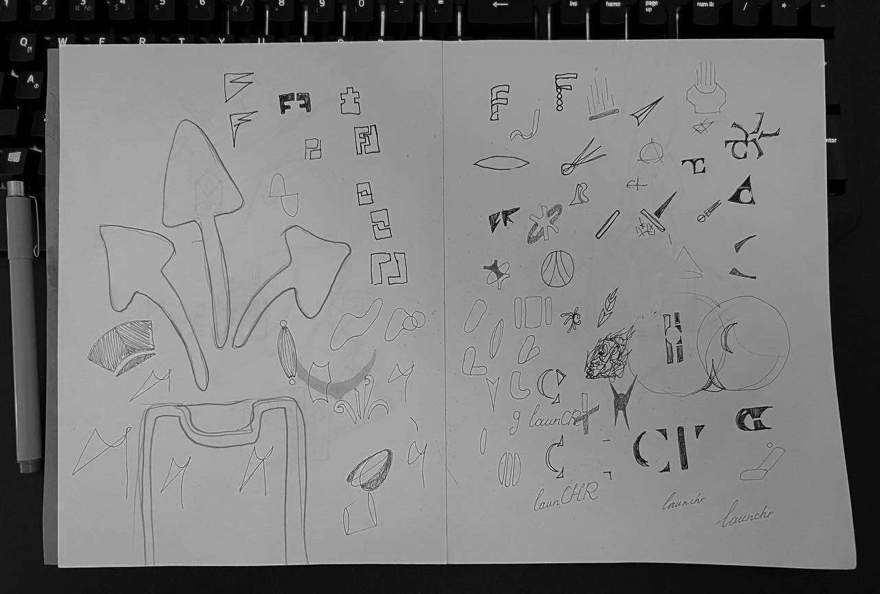
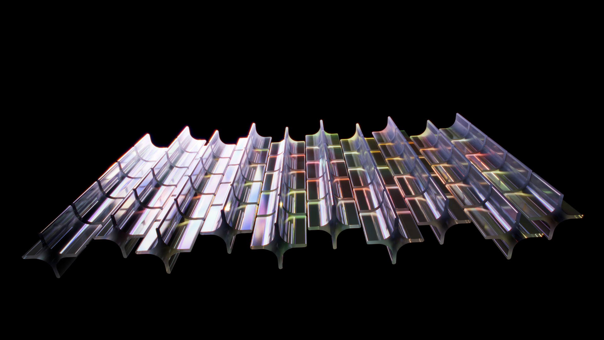
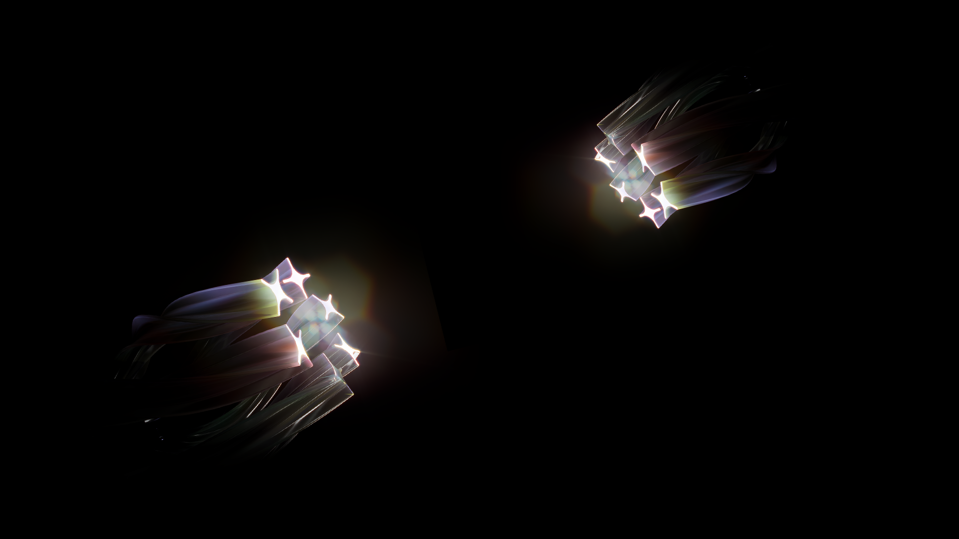
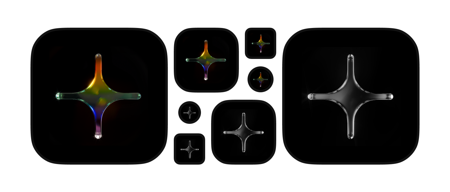
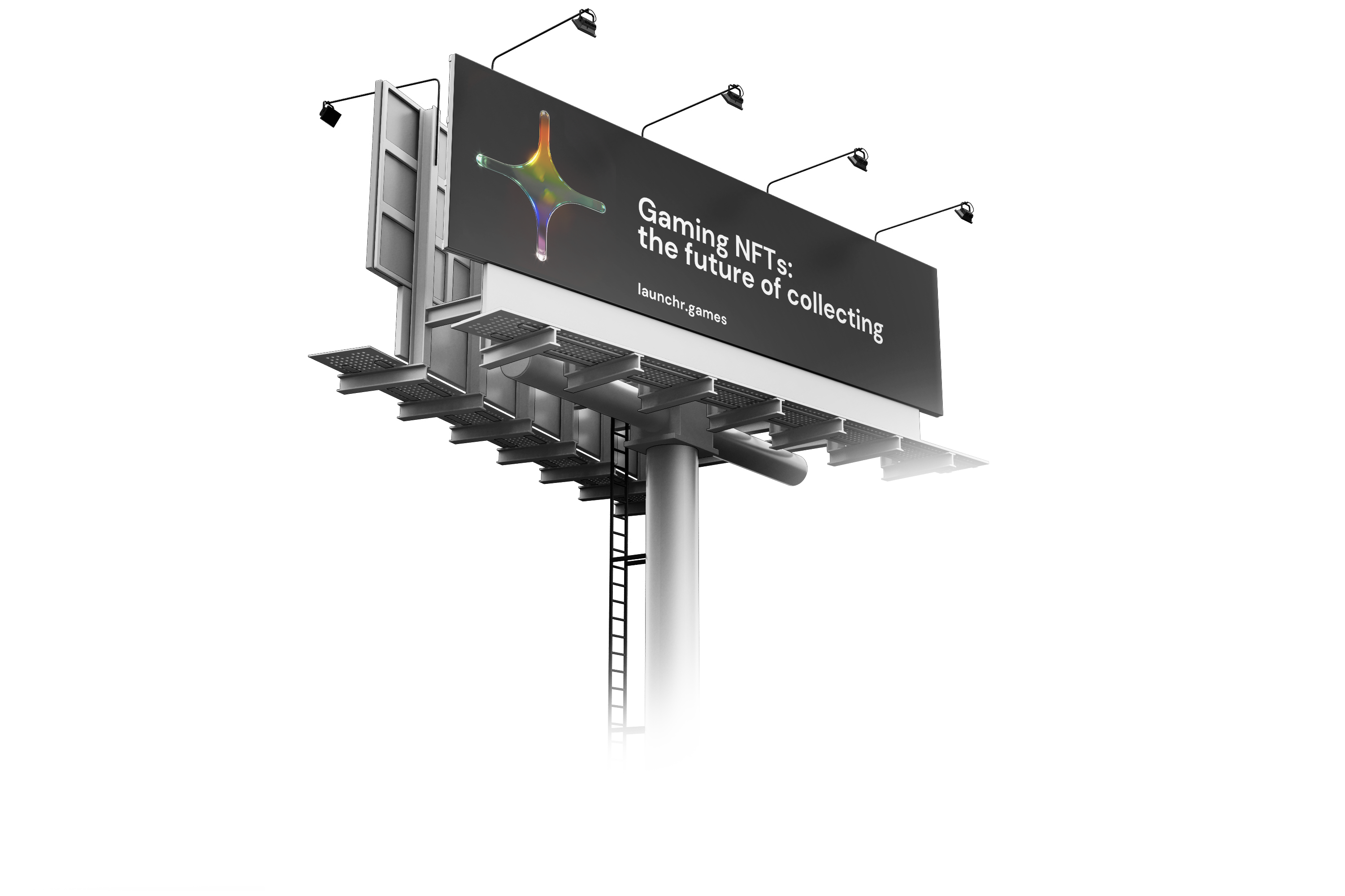
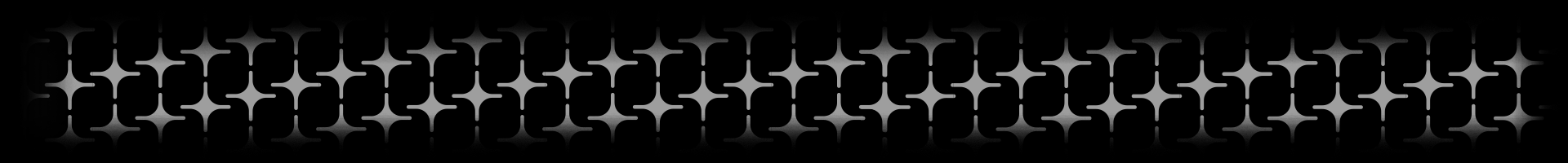
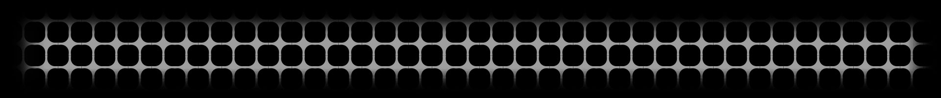
Examples of possible shapes that we get from the idea of the light wavelength:

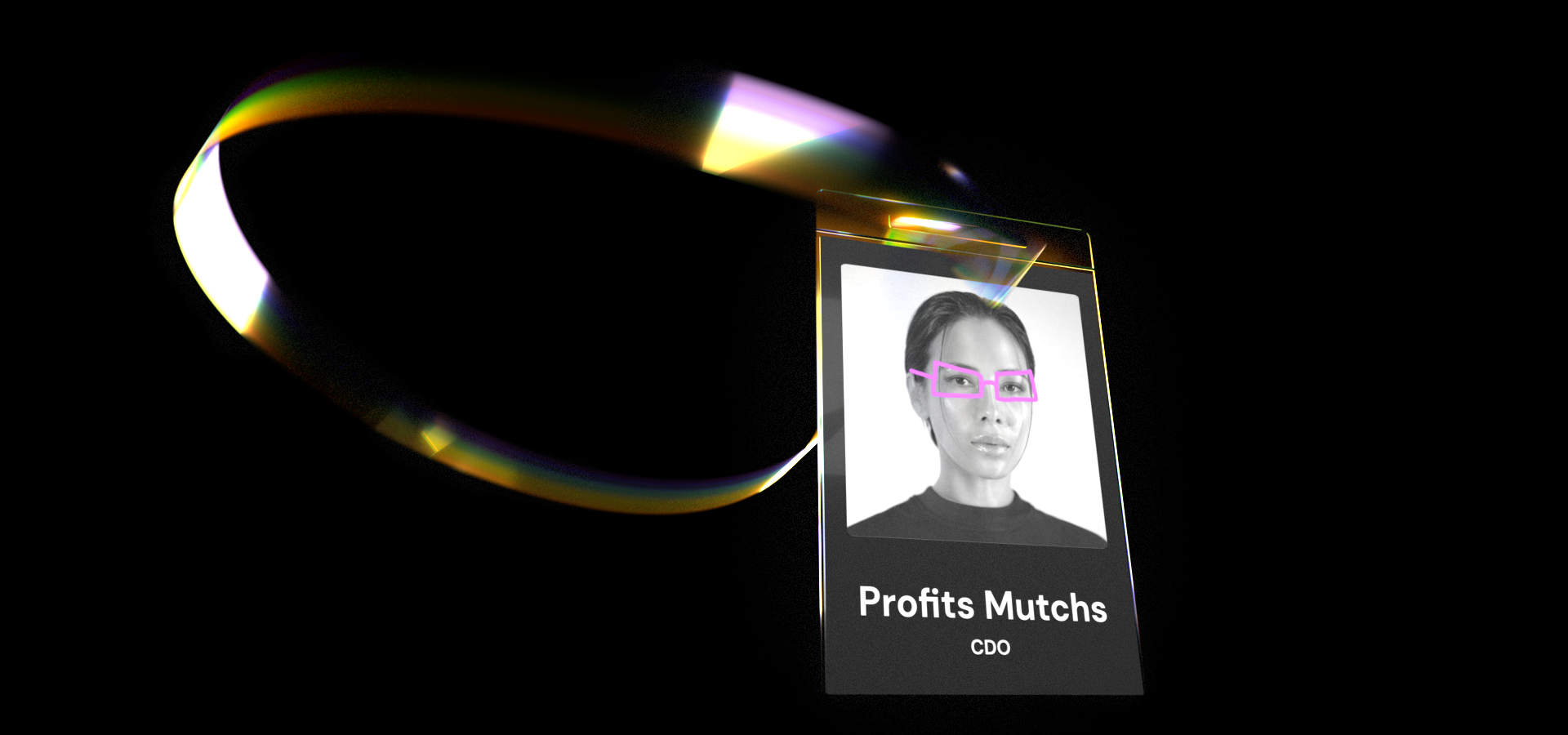
Example №2: Employee photos on the website. Black & white photos in combination with the color of their choice, i.e. Karl has yellow glasses or Nick`s whole photo becomes tinted with red color on mouse hover. We are inclusive, we value the unique skills/traits/characteristics of each person, and we let them thrive and grow. In a way LaunCHR works both ways - outside (game partners) and inside (employees).

Brightness

Similar to our color palette, we can also implement a brightness guide.

Void
Silicone
Ash
Overdrive
Echo
Starshine

Typography

Heading

I chose DM Sans. While some might consider this font to be basic or standard, I believe it's exactly what we need.

One of the font's key strengths is its versatility, making it well-suited for any promotional material or game without looking out of place. It's sharp and elegant.

Additionally DM Sans is widely available and accessible, making it a practical choice for our diverse audience. Its clear and readable design makes it perfect for various platforms.

In summary, while DM Sans may not be the flashiest or most unique font, I believe it's the perfect fit for our branding and marketing efforts due to its versatility, accessibility, and elegant design.

Paragraph

I have selected Varela Round as our secondary font for paragraph text. This font has several excellent qualities that make it an ideal complement to DM Sans.

One of Varela Round's most notable features is its rounded design, which aligns with our logo's aesthetic and creates a welcoming and approachable feel. This quality helps to balance the more rigid and structured appearance of DM Sans, creating an overall harmonious design.

Varela Round works exceptionally well for large blocks of text. This font's softer appearance and gentle curves make it easy on the eyes, ensuring that readers can focus on the content without experiencing any visual strain.

Overall, Varela Round is an excellent choice for our secondary font. Its roundness, welcoming appearance, and readability will all help to enhance our design and improve the user experience for those interacting with our content.

Visual style & Graphics

Marketplace

Mobile & Desktop

Fav Icon

An icon in the browser tab

App Icons

iOS, Android, PC, Mac, etc.

Badge

T-Shirt

Instagram Stories

Billboard

Text Composition

Patterns

By building a pattern that incorporates our logo as a key element
we can reinforce our brand identity across various touch points and create a cohesive and memorable visual language.

LaunCHR Points

The shape is inspired by the concept of a coordinate system (X, Y, Z) and its rounded design is similar to our logo, akso reminding a ship's steering wheel.
Which should reflect how versatile these points are. This idea is pushed further with the addition on colors. No matter what the game is - this currency fits to any.

To be continued?